Packaging
Que Pasa
The Ask: Packaging Design
Agency: Nature’s Path
Role: Creative Director
The Que Pasa team’s passion for the perfect organic tortilla chip inspired our fresh, versatile packaging design, crafted to fit any snack aisle. Hints of the volcanic stone-ground process give the design authenticity, while its vibrant look—available in multiple sizes—stands out beautifully on environmentally friendly paper. This unique packaging, combined with the chips' irresistible flavor, has made Que Pasa a hit, securing spots in all your favorite stores and keeping it top of mind for snack lovers everywhere.

Chickapea
The Ask: Identity & Packaging Redesign
Agency: Venture Communications
Role: Creative Director
With a bold, streamlined design, we redefined our client’s brand and packaging, capturing attention in the competitive organic market. Our approach included a refreshed logo, unified packaging for the product line, and an integrated digital campaign promoting healthy, organic options. This sleek new look stands out on the shelves, appealing to discerning consumers searching for quality and natural goodness in every bite.
Sample display ad.


The creative strategy was a resounding success, and the campaign exceeded all expectations in terms of sales and brand awareness. For the launch, we pulled out all the stops and exceeded our own goals, solidifying our place in the market and establishing ourselves as a leader in the industry. It was a triumph that was the result of hard work, dedication, and a passion for creating something truly special. We are so proud of the impact this campaign had and can't wait to see what the future holds.
North Prairie Gold
The Ask: Identity & Packaging Redesign
Agency: Venture Communications
Role: Creative Director
We transformed North Prairie Gold Canola Oil’s packaging into a standout with detailed illustrations and a QR code linking buyers directly to the farmers’ stories. This design brought the product’s roots to life, connecting consumers with Canadian farmers and their ethical practices. The packaging also featured food pairings and cooking tips, adding value for new buyers seeking ethically produced, locally made products. Our work extended to a refreshed brand identity and mantra, clearly reflecting the unique story and values behind this Canadian-made oil.


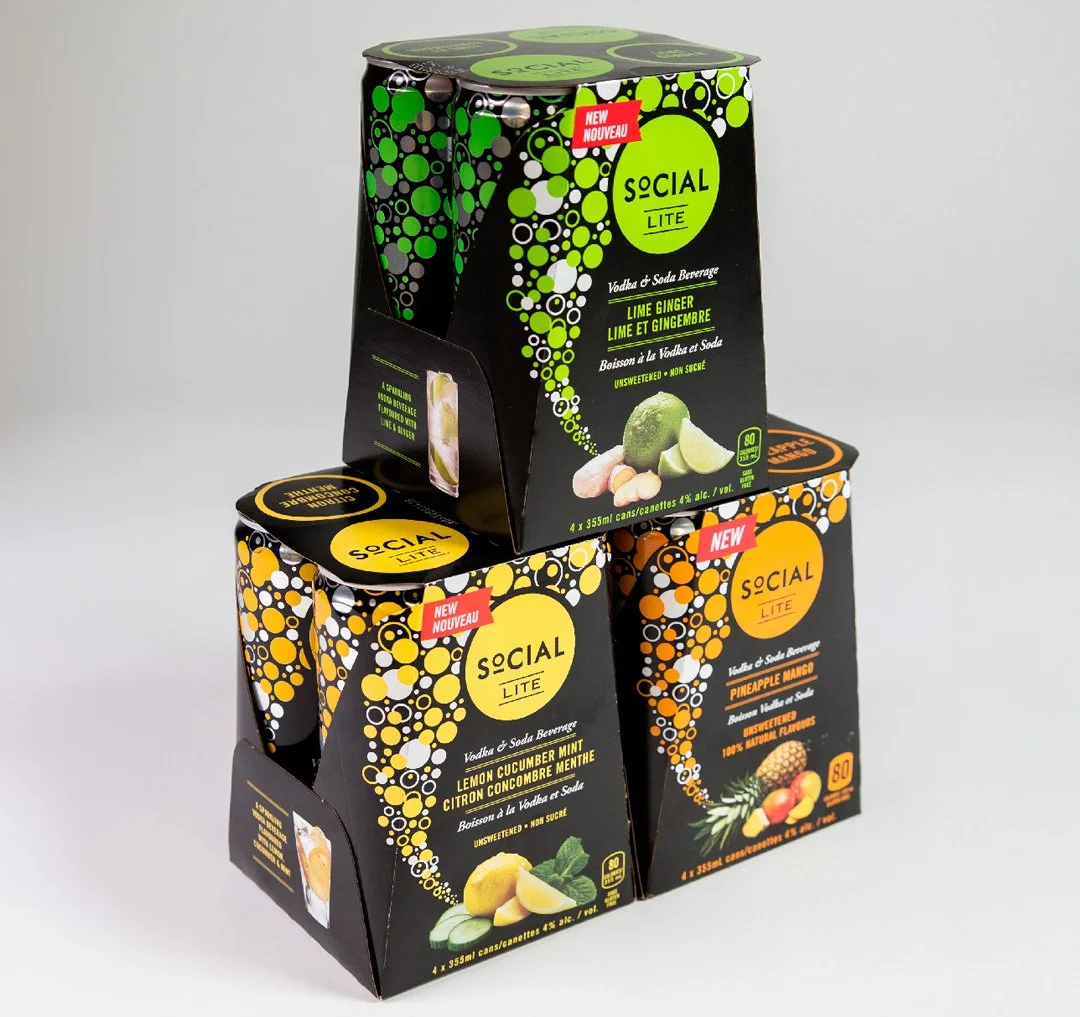
Social Lite
The Ask: Packaging Refresh
Agency: Venture Communications
Role: Creative Director
Social Lite had the logo, but it needed the fun. We added a playful bubble graphic that flowed across the drink family, bringing sophistication with a pop of party. This fresh design appealed to a new crowd looking for a lively, low-calorie option without sacrificing taste. The result? A drink that’s as exciting on the outside as it is light and flavorful on the inside.